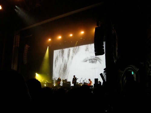
Sigur Rós performing at Arlene Schnitzer Concert Hall this past October
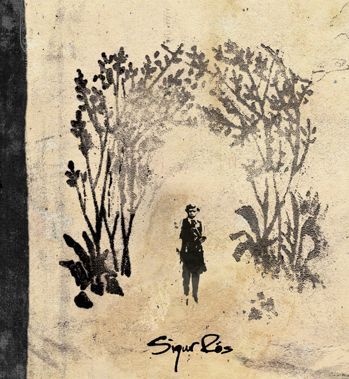
Back in 2001 a close friend of mine introduced me to Ágætis byrjun, which happens to be a Sigur Rós album. My love for the band didn't come so soon and apparently I wasn't the only one. It took the following two years for Sigur Rós to finally got noticed internationally. I can say 2001 was also the year that I was also falling madly in love with post-emo indie rock bands... Sunny Day Real Estate, Cap'n Jazz, Promise Ring, and Joan of Arc. So it wasn't a surprise that a group from a similar genre, post-rock, would literally warm my heart. I love their minimalistic, atmospheric, and yet classical sound. Sigur Rós has not only inspired me through their melancholy music, but also through their album artwork, which has inspired me as an Artist.
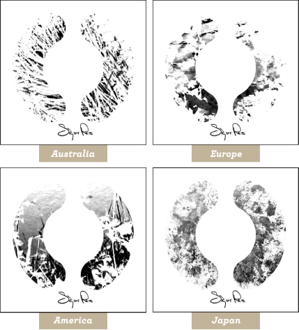
Now, I don't want to get all "Wikipedian" on you, but for those out there that don't know the meaning behind Sigur Rós' album titled ( ) I feel like I should give you some insight about the album. Also known as "The Bracket Album" or "The Untitled Album" it was first released in 2002. For those out there that have no clue of this Icelandic group (I'm aware of many... still.) can you believe it has sold over 500,000 copies worldwide to date? The album's songs have been divvied up into two halves by a 30 second sound of stillness. Jónsi Birgisson, the vocalist sings a made up language throughout the whole album. The band calls this fanciful language Vonlenska which is a "constructed language of nonsense syllables which resembles the phonology of the Icelandic language." Sigur Rós wanted their fans to jot down their own interpretations of their music by providing a booklet composed of tracing paper. The 12-page booklet also included various black and white natural elements which are revealed on the front of the album through the parentheses diecut. These natural elements of grass, bushes, and ponds were manipulated from photographs the band snapped just outside of their recording studio... amazing! And there are even four versions of the album cover out there. They were distributed around the world, into four different regions...
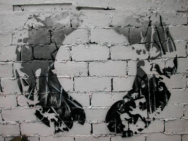
I came across these articulate stencil graffiti images (posted below) which were created by fans. I like how the positive and negative space work hand in hand with the brick texture.
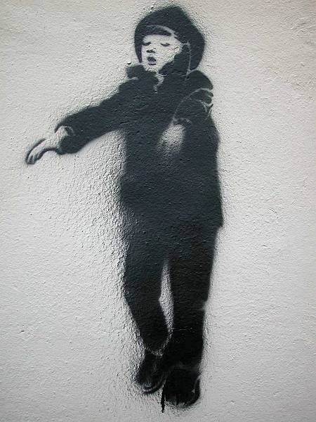
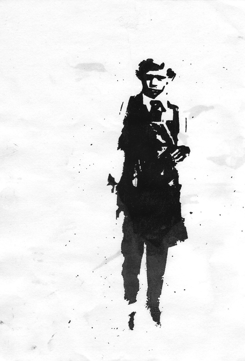
This image was originally displayed petite on the back of the CD. It's marvelous to see "sleepwalker" enlarged and stenciled on a wall in Reykjavík... and how the spraypaint runs from the boy's shoe and evolves into a shoelace.
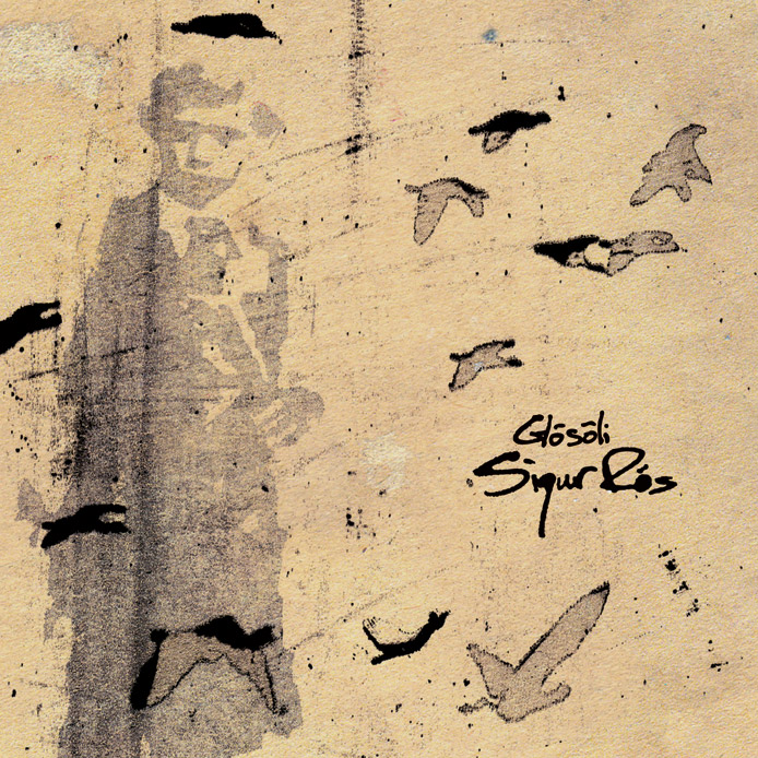
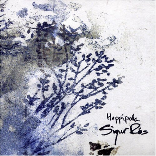
Below are some of my other favorite Sigur Rós albums. I hope these works have inspired you as much they have for me and maybe inspire you to spend your weekend doing a little creating of your own. Cheers!
